Pretty Tulips
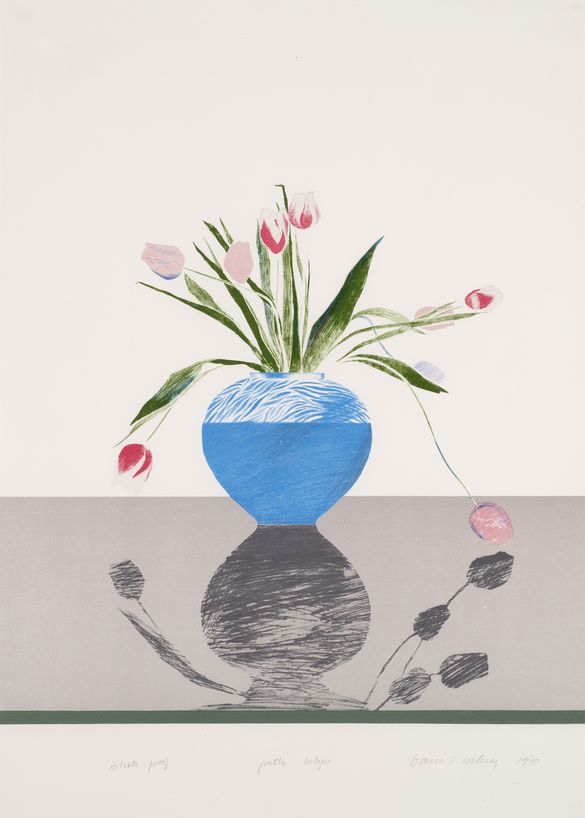
David HockneyDavid Hockney's Pretty Tulips is a six-colour lithograph that reinterprets the still life tradition with a modern sensibility. The artwork depicts a vase of tulips, their delicate red, pink, and white petals arranged in a loose and dynamic composition. Some of the flowers stand upright, while others droop gracefully, suggesting the fleeting nature of beauty and life.
The vase itself is rendered in striking blue and white, its subtle pattern providing texture and contrast against the muted background. Below, the vase’s shadow is reflected as a distorted silhouette, adding depth and an abstract dimension to the otherwise naturalistic depiction. The reflection grounds the composition, creating a balance between form and space while inviting viewers to engage with the duality of presence and perception.
Hockney’s skilful use of six colours enhances the sense of harmony in the piece. The bright tulips and vibrant vase stand out against the subdued, neutral tones of the table and background, emphasising the composition’s minimalist yet carefully considered structure. The simplicity of the setting highlights the vibrancy and elegance of the flowers while introducing a meditative quality.
Created during a period when Hockney was deeply engaged with printmaking, Pretty Tulips showcases his innovative approach to this medium. By combining bold colours, thoughtful line work, and an exploration of reflection, the piece transforms an everyday subject into a striking and contemporary artwork.
Through its blend of traditional and modern elements, Pretty Tulips reflects Hockney’s ability to see beauty in simplicity and to reimagine familiar motifs in new and meaningful ways.
David Hockney's Pretty Tulips is a six-colour lithograph that reinterprets the still life tradition with a modern sensibility. The artwork depicts a vase of tulips, their delicate red, pink, and white petals arranged in a loose and dynamic composition. Some of the flowers stand upright, while others droop gracefully, suggesting the fleeting nature of beauty and life.
The vase itself is rendered in striking blue and white, its subtle pattern providing texture and contrast against the muted background. Below, the vase’s shadow is reflected as a distorted silhouette, adding depth and an abstract dimension to the otherwise naturalistic depiction. The reflection grounds the composition, creating a balance between form and space while inviting viewers to engage with the duality of presence and perception.
Hockney’s skilful use of six colours enhances the sense of harmony in the piece. The bright tulips and vibrant vase stand out against the subdued, neutral tones of the table and background, emphasising the composition’s minimalist yet carefully considered structure. The simplicity of the setting highlights the vibrancy and elegance of the flowers while introducing a meditative quality.
Created during a period when Hockney was deeply engaged with printmaking, Pretty Tulips showcases his innovative approach to this medium. By combining bold colours, thoughtful line work, and an exploration of reflection, the piece transforms an everyday subject into a striking and contemporary artwork.
Through its blend of traditional and modern elements, Pretty Tulips reflects Hockney’s ability to see beauty in simplicity and to reimagine familiar motifs in new and meaningful ways.
Camden Art Collection
The London Borough of Camden Art Collection consists of just under 1,000 items that include works on paper, paintings and sculptures. The main focus of the collection is works dating from the late 1950s to the late 1980s, with many pieces by artists who lived in the Borough. Many of these works were inherited from the predecessor authorities who were gifted these pieces when the Council was established in 1965. Other works were directly purchased by the Council from 1965 to 1985, with limited funding from a ‘picture loan’ scheme that the Council operated.